I’m excited to share that the latest release of the {bslib} R package makes a significant step towards being our recommended way to create Shiny dashboards. Grab it now from CRAN with:
install.packages("bslib")This release includes a major overhaul of our documentation, including new and updated articles and better organization of content. The bslib site nows groups these articles by whether you’re just get started, or want to dive deeper into theming, UI components, or layouts. If you’re primarily interested in making dashboards, make sure to visit the Getting Started with dashboards article.
In this blog post, I’ll discuss some of the new features that contribute to the dashboarding experience, as well as why we’ve chosen bslib as the home for this work. You can run the examples in this post yourself (without having to install anything!) in this Posit Cloud project.
Hello dashboards
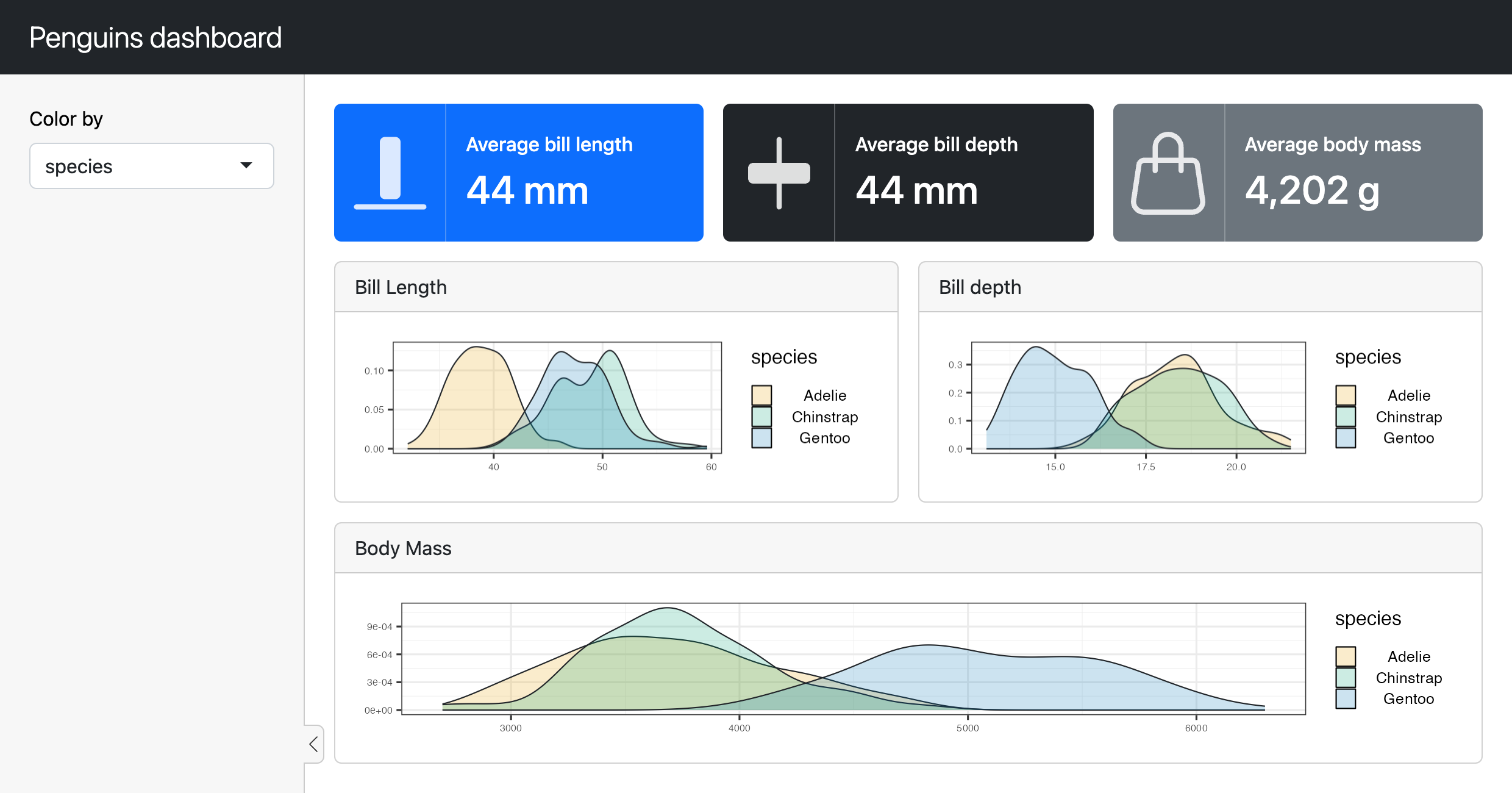
bslib’s last release first introduced some important dashboard components (e.g., cards, value boxes, etc), but this release adds other essential pieces such as sidebar layouts, filling layouts, new column-wise layouts, accordions, and more. bslib’s new Getting Started with dashboards article introduces all these pieces by first starting with a basic app and working towards some non-trivial dashboards, like the one below:
Why bslib? Themable dashboards
Since we announced it at rstudio::conf(2020)1, bslib has made it easy to theme virtually any Shiny app, R Markdown document, or R project that utilizes Bootstrap. One notable and unfortunate exception has been shinydashboard, arguably the most popular UI extension for Shiny apps.
While projects like bs4Dash and fresh have helped provide way to upgrade shinydashboard’s Bootstrap/AdminLTE dependency and theme dashboards, AdminLTE has kept shinydashboard from keeping up with modern versions of Bootstrap (now on version 5).
Rather than rewriting shinydashboard, we’re choosing to expand the footprint of bslib. It now provides themable and modern Bootstrap components that are perfect for dashboard apps, meaning that you can expect real time themes, Bootswatch themes, and custom themes to “just work” like they do for most other Shiny apps and R Markdown docs powered by bslib.
Layout tooling
This release includes two big improvements to layouts. First, bslib has been re-worked to fully embrace filling layouts by default. This means that things like page_sidebar(), page_navbar(), and page_fillable() all encourage their children to fill the window (by default), and components like card() also encourage their contents to fill when made full-screen. Keep in mind, filling layouts aren’t always the best choice for every situation, but you can always specify fixed sizes, restrict resizing limits, or opt-out of filling layout.
Second, we’ve added layout_columns(), a new approach to column-wise layout. Compared to shiny::fluidRow()/shiny::column(), this newer interface to Bootstrap’s 12-column grid layout system is much more expressive and is compatible with filling layouts. For example, in just one function call, you can express a 12-column layout with multiple rows (and control the row heights), define negative space, and even responsively change the layout depending on screen size with a new breakpoints() helper function.
Accordions
This release also includes a new accordion component, which is a great way to save space by hiding content behind a collapsible header. Accordions can be useful in a variety of apps, but in the context of dashboards, they’re quite useful for grouping numerous related inputs together.
Closing thoughts
With this release, we now view bslib as a viable alternative to shinydashboard, and plan on making more improvements geared towards making dashboard creation an even more delightful experience. Compared to shinydashboard, bslib offers:
A fresh take on components which build on the latest Bootstrap, add new features (e.g., full screen expansion, sidebars, etc), and are more customizable.
More theming options including real-time theming, bootswatch themes, main colors / fonts, and more.
Better layout tools, like filling and column-wise layouts. You may have noticed that it wasn’t easy to get a row of cards generated by
shinydashboard::box()to have a common height, butlayout_columns()andlayout_column_wrap()do this automatically.Portability: bslib is compatible with most Bootstrap projects, and can be used to create dashboards, websites, R Markdown documents, and more.
That said, bslib is still a work in progress, and we’re still working on making it a “complete” dashboarding solution. If you find yourself missing certain aspects of shinydashboard, or generally have ideas things we should add, please let us know by filing an issue and/or contributing to this discussion.