We’re thrilled to announce the latest version of ShinyUIEditor. The main feature of this new release is support for the new bslib::card() component. The new bslib cards provide an easy-to-use and attractive way to wrap related content in your app. In addition to the new cards, this release adds a “static text” component for adding simple descriptions or instructions to your app, fixes a number of bugs, and improves performance across the editor. A full list of changes is available on the editor’s website.
Before getting started
This release depends on you having the latest version of the gridlayout and bslib packages. Make sure those are up-to-date!
install.packages("remotes")

# Install dependencies using the remotes package
remotes::install_github("rstudio/bslib")
remotes::install_github("rstudio/gridlayout")
remotes::install_github("rstudio/shinyuieditor")
bslib::card()
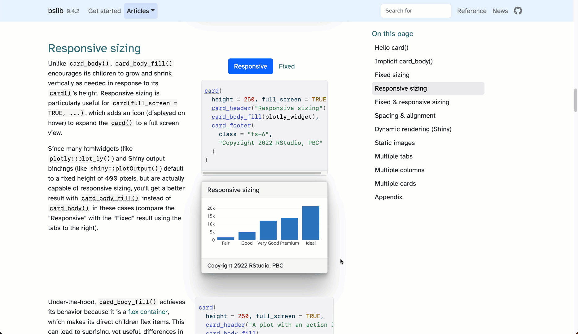
Recently the bslib package added a card component that allows for the intuitive sizing of elements. These cards have powerful features like automatically growing their contents to fill the available space. This is especially useful for things like plots. Combined with an optional full-screen mode, it can make it super easy for users to dig into a specific view of your app without navigating to a different page or app. For more info, check out the blog post announcing cards.
Adding cards to your app
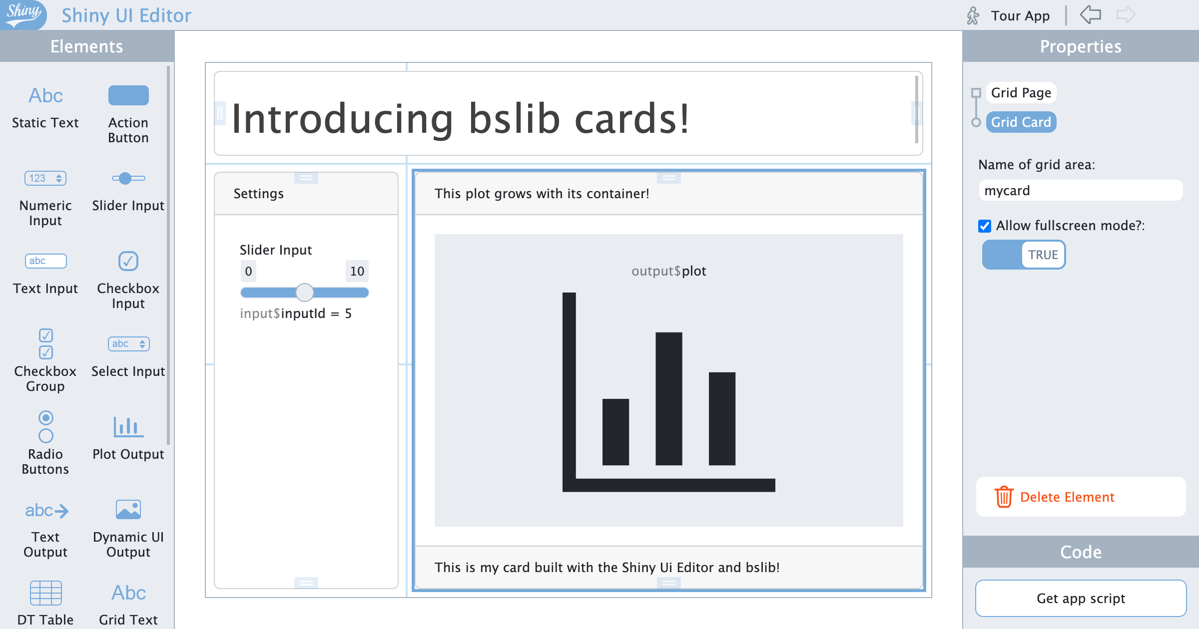
Getting started with cards is as simple as dragging the card element from the elements palette onto your app. You can place these cards directly on a grid layout, in a tab panel, or even inside another card.
Adding content to the card
Once the card is in the app you can drag new items into either the card header, body, or footer. For instance, we could drag a plot into the card. This plot will now intelligently size itself to take up all the space it can in the card:
Full-screen mode
Another nice feature of the cards is the full-screen toggle. Just like in the bslib::card() component this allows us to expand the card to take up the full app’s screen. In the editor we can use this to zoom into our card for more fine-grained control of our contents.
Going forward
We believe the addition of bslib cards significantly enhances the ability to create sleek and modern user interfaces using the UI editor: ultimately making more engaging apps for your users. This isn’t the end of new UI components from bslib being added to the editor. Going forward, we will be adding the new modern UI components from bslib to the editor with the goal of making the UI editor the easiest and fastest way to make great-looking Shiny apps.
Links
To see the new card component in action and learn more about this release, check out the links below:
We hope you enjoy this new release and look forward to hearing your feedback. Your opinions are crucial to our work in creating the best user interface design tool, and we thank you for your continued support.
Happy designing!