Arrange Elements
Layout elements into rows and columns that responsively adapt to a wide range of screen sizes.
Shiny provides two core functions for arranging elements into rows and columns:
ui.layout_columns()uses Bootstrap’s 12-column CSS Grid to create responsive and highly customizable layouts;ui.layout_column_wrap()arranges elements into a grid with equally-sized cells.
You can use these functions directly to create your own layout. Grid layouts can be used within a page, panel, or card and can even be nested within each other.
Relevant Functions
-
ui.layout_columns
ui.layout_columns(*args, col_widths=None, row_heights=None, fill=True, fillable=True, gap=None, class_=None, height=None, min_height=None, max_height=None, **kwargs) -
ui.layout_column_wrap
ui.layout_column_wrap(*args, width=MISSING, fixed_width=False, heights_equal='all', fill=True, fillable=True, height=None, min_height=None, max_height=None, height_mobile=None, gap=None, class_=None, **kwargs) -
ui.page_fixed
ui.page_fixed(*args, title=None, lang=None, theme=None, **kwargs) -
ui.page_fillable
ui.page_fillable(*args, padding=None, gap=None, fillable_mobile=False, title=None, lang=None, theme=None, **kwargs) -
ui.page_fluid
ui.page_fluid(*args, title=None, lang=None, theme=None, **kwargs) -
ui.page_html
ui.page_html(html, *, extra_deps=None, deps_replace_pattern=DEPS_PLACEHOLDER)
Grid Layouts
Both ui.layout_columns() and ui.layout_column_wrap() follow the same general pattern: pass each function a series of elements to have them arranged into a grid layout.
#| '!! shinylive warning !!': |
#|   shinylive does not work in self-contained HTML documents.
#|   Please set `embed-resources: false` in your metadata.
#| standalone: true
#| components: [viewer]
#| layout: horizontal
#| viewerHeight: 175

## file: app.py
from shiny import App, ui

app_ui = ui.page_fillable(
    "ui.layout_columns()",
    ui.layout_columns(
        ui.card("Card 1"),
        ui.card("Card 2"),
        ui.card("Card 3"),
    ),
)


def server(input, output, session):
    pass


app = App(app_ui, server=server)
#| '!! shinylive warning !!': |
#|   shinylive does not work in self-contained HTML documents.
#|   Please set `embed-resources: false` in your metadata.
#| standalone: true
#| components: [viewer]
#| layout: horizontal
#| viewerHeight: 175

## file: app.py
from shiny import App, ui

app_ui = ui.page_fillable(
    "ui.layout_column_wrap()",
    ui.layout_column_wrap(
        ui.card("Card 1"),
        ui.card("Card 2"),
        ui.card("Card 3"),
    ),
)


def server(input, output, session):
    pass


app = App(app_ui, server=server)
Notice two things about the above apps:
Both approaches create one or more rows, filling the rows with columns to hold its children.
Use the handle in the bottom right corner of the apps above to view each layout at different screen sizes (this works best on desktop screens). How do the layouts shift as the screen gets smaller or larger?
How to choose between layout_columns() and layout_column_wrap()
For simple layouts, it can be hard to tell ui.layout_columns() and ui.layout_column_wrap() apart. Here’s a short set of questions to ask yourself to help you decide which function to use:
Are all of the items in your arrangement the same, such as a set of cards or plots? And do you want them all to have the same width and height?
If yes:
ui.layout_column_wrap()is best for a regularly-sized grid for a homogenous collection of elements.Do you want to customize the layout’s column widths, or to have different layouts at different screen sizes (mobile vs desktop vs ultrawide)?
If yes:
ui.layout_columns()give you the tools to create highly customized, resposive column layouts.For all other uses, pick the function you like the most. I happen to like
ui.layout_columns()but you might preferui.layout_column_wrap().
Responsive, configurable column layouts
In the example above, we saw that, without your intervention, ui.layout_columns() will arrange the elements given to it into evenly sized columns. In the default case, ui.layout_columns() makes a choice about the column widths that make the most sense based on the number of items provided.
For example, when given three items, ui.layout_columns() places each item in a column with 4 width units. You can use the col_widths argument to choose a different allocation of column width units. Keep in mind that Bootstrap’s CSS Grid uses 12 units per row. In the example below, we use col_widths=(2, 4, 6) to create a row with a small, medium, and large card.
#| '!! shinylive warning !!': |
#|   shinylive does not work in self-contained HTML documents.
#|   Please set `embed-resources: false` in your metadata.
#| standalone: true
#| components: [viewer]
#| layout: horizontal
#| viewerHeight: 240

## file: app.py
from shiny import App, ui

app_ui = ui.page_fillable(
    ui.layout_columns(
        ui.card("Card 1"),
        ui.card("Card 2"),
        ui.card("Card 3"),
        col_widths=(2, 4, 6),
    ),
)


def server(input, output, session):
    pass


app = App(app_ui, server=server)
There’s a lot more that layout_columns() can do with col_widths to make highly customized layouts.
Choose different layouts with a dictionary of column widths at specific breakpoints, e.g.
col_widths={"sm": 4, "md": (2, 4, 6)}.Insert empty space between items with a negative column width, e.g.
col_widths=c(4, -4, 4)creates two columns 4 units wide with an empty space of 4 units between them.
Uniform grid layouts
ui.layout_column_wrap() arranges elements into a uniform grid, so its width argument applies a single value to all elements in the grid.
When width is a fractional each item is given an equal portion of the row’s width. For example, width=1 / 2 gives each item half of the row width.
#| '!! shinylive warning !!': |
#|   shinylive does not work in self-contained HTML documents.
#|   Please set `embed-resources: false` in your metadata.
#| standalone: true
#| components: [viewer]
#| layout: horizontal
#| viewerHeight: 240

## file: app.py
from shiny import App, ui

app_ui = ui.page_fillable(
    ui.layout_column_wrap(
        ui.card("Card 1"),
        ui.card("Card 2"),
        ui.card("Card 3"),
        ui.card("Card 4"),
        width=1 / 2,
    ),
)


def server(input, output, session):
    pass


app = App(app_ui, server=server)
When width is a CSS unit, like "300px", ui.layout_column_wrap() ensures that every item is at least as wide as width. The items in the grid expand to fill horizontal space or contract when the layout container is smaller than width.
Try resizing the app preview below to see how the layout shifts at different container widths.
#| '!! shinylive warning !!': |
#|   shinylive does not work in self-contained HTML documents.
#|   Please set `embed-resources: false` in your metadata.
#| standalone: true
#| components: [viewer]
#| layout: horizontal
#| viewerHeight: 240

## file: app.py
from shiny import App, ui

app_ui = ui.page_fillable(
    ui.layout_column_wrap(
        ui.card("Card 1"),
        ui.card("Card 2"),
        ui.card("Card 3"),
        ui.card("Card 4"),
        width="300px",
    ),
)


def server(input, output, session):
    pass


app = App(app_ui, server=server)
Column nesting
Both ui.layout_columns() and ui.layout_column_wrap() can be nested, even within each other.
Consider this page layout:
#| '!! shinylive warning !!': |
#|   shinylive does not work in self-contained HTML documents.
#|   Please set `embed-resources: false` in your metadata.
#| standalone: true
#| components: [viewer]
#| layout: horizontal
#| viewerHeight: 200

## file: app.py
from shiny import App, ui

app_ui = ui.page_fillable(
    ui.layout_columns(
        ui.card("Card 1"),
        ui.card(
            "Card 2",
            ui.layout_columns(
                ui.card("Card 2.1"),
                ui.card("Card 2.2"),
                width=1 / 2,
            ),
        ),
        col_widths=(4, 8),
    ),
)


def server(input, output, session):
    return None


app = App(app_ui, server)
Controlling for page width and height
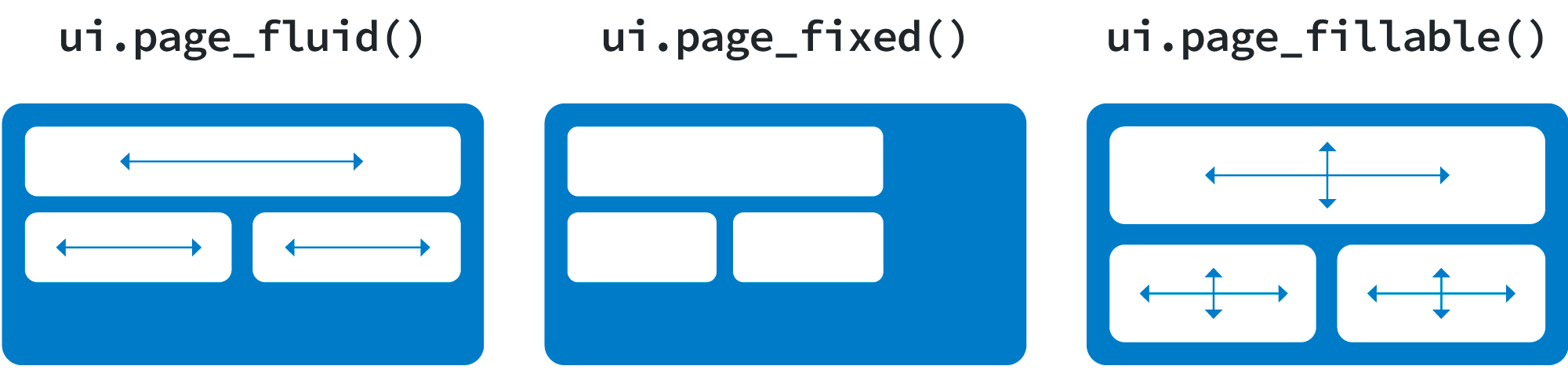
There are multiple types of Shiny grids: fluid, fixed, and fillable. The fluid grid system is recommended for most applications and is the default for Shiny functions like ui.page_navbar() and ui.page_sidebar(). So far, all the examples on this page have used the fluid grid system.
Each grid system uses a flexibly sub-dividable 12-column grid for layout. They differ in how they interact with the viewer’s browser window:
The fluid system always occupies the full width of the web page and re-sizes its components dynamically as the size of the page changes.
The fixed system occupies a fixed width of 940 pixels by default and may assume other widths when Bootstrap’s responsive layout kicks in (e.g., when on a tablet).
The fillable system always occupies the full width and height of the web page and re-sizes its components dynamically as the size of the page changes.
Fluid Grid System
#| '!! shinylive warning !!': |
#|   shinylive does not work in self-contained HTML documents.
#|   Please set `embed-resources: false` in your metadata.
#| standalone: true
#| components: [viewer]
#| layout: horizontal
#| viewerHeight: 500

## file: app.py
import matplotlib.pyplot as plt
import numpy as np
from shiny import App, render, ui

app_ui = ui.page_fluid(
    ui.layout_sidebar(
        ui.sidebar(
            ui.input_slider("n", "N", 0, 100, 20),
        ),
        ui.output_plot("histogram"),
    ),
)


def server(input, output, session):
    @output
    @render.plot(alt="A histogram")
    def histogram():
        np.random.seed(19680801)
        x = 100 + 15 * np.random.randn(437)
        plt.hist(x, input.n(), density=True)


app = App(app_ui, server, debug=True)
import matplotlib.pyplot as plt
import numpy as np
from shiny import App, render, ui

app_ui = ui.page_fluid(
    ui.layout_sidebar(
        ui.sidebar(
            ui.input_slider("n", "N", 0, 100, 20),
        ),
        ui.output_plot("histogram"),
    ),
)


def server(input, output, session):
    @output
    @render.plot(alt="A histogram")
    def histogram():
        np.random.seed(19680801)
        x = 100 + 15 * np.random.randn(437)
        plt.hist(x, input.n(), density=True)


app = App(app_ui, server, debug=True)
To make a fluid grid that adapts to the width of the user’s viewing window, build your app UI with ui.page_fluid.
Fixed Grid System
#| '!! shinylive warning !!': |
#|   shinylive does not work in self-contained HTML documents.
#|   Please set `embed-resources: false` in your metadata.
#| standalone: true
#| components: [viewer]
#| layout: horizontal
#| viewerHeight: 500

## file: app.py
import matplotlib.pyplot as plt
import numpy as np
from shiny import App, render, ui

app_ui = ui.page_fixed(
    ui.layout_sidebar(
        ui.sidebar(
            ui.input_slider("n", "N", 0, 100, 20),
        ),
        ui.output_plot("histogram"),
    ),
)


def server(input, output, session):
    @output
    @render.plot(alt="A histogram")
    def histogram():
        np.random.seed(19680801)
        x = 100 + 15 * np.random.randn(437)
        plt.hist(x, input.n(), density=True)


app = App(app_ui, server, debug=True)
import matplotlib.pyplot as plt
import numpy as np
from shiny import App, render, ui

app_ui = ui.page_fixed(
    ui.layout_sidebar(
        ui.sidebar(
            ui.input_slider("n", "N", 0, 100, 20),
        ),
        ui.output_plot("histogram"),
    ),
)


def server(input, output, session):
    @output
    @render.plot(alt="A histogram")
    def histogram():
        np.random.seed(19680801)
        x = 100 + 15 * np.random.randn(437)
        plt.hist(x, input.n(), density=True)


app = App(app_ui, server, debug=True)
To make a fixed grid that maintains a constant maximum width, build your app UI with ui.page_fluid.
The fixed grid system maintains a fixed page width of 940 pixels by default. If Bootstrap responsive features are enabled (they are by default in Shiny) then the grid will also adapt to be 724px or 1170px wide depending on your viewport (e.g., when on a tablet). The fixed system does this by using Bootstrap .containers, whereas the fluid system uses Bootstrap .container-fluids. Learn more about the difference here.
The main benefit of a fixed grid is that it provides stronger guarantees about how users will see the various elements of your UI laid out (because it’s not being dynamically laid out according to the width of the browser). The main drawback is that a fixed grid is more complex to work with. In general, we recommend using a fluid grid unless you absolutely require the lower level layout control afforded by a fixed grid.
Fillable Grid System
#| '!! shinylive warning !!': |
#|   shinylive does not work in self-contained HTML documents.
#|   Please set `embed-resources: false` in your metadata.
#| standalone: true
#| components: [viewer]
#| layout: horizontal
#| viewerHeight: 425

## file: app.py
import matplotlib.pyplot as plt
import numpy as np
from shiny import App, render, ui

app_ui = ui.page_fillable(
    ui.layout_sidebar(
        ui.sidebar(
            ui.input_slider("n", "N", 0, 100, 20),
        ),
        ui.output_plot("histogram", height="100%"),
    ),
)


def server(input, output, session):
    @output
    @render.plot(alt="A histogram")
    def histogram():
        np.random.seed(19680801)
        x = 100 + 15 * np.random.randn(437)
        plt.hist(x, input.n(), density=True)


app = App(app_ui, server, debug=True)
import matplotlib.pyplot as plt
import numpy as np
from shiny.express import input, render, ui

ui.page_opts(fillable=True)

with ui.sidebar():
    ui.input_slider("n", "N", 0, 100, 20)


@render.plot(alt="A histogram")
def histogram():
    np.random.seed(19680801)
    x = 100 + 15 * np.random.randn(437)
    plt.hist(x, input.n(), density=True)
import matplotlib.pyplot as plt
import numpy as np
from shiny import App, render, ui
app_ui = ui.page_fillable(
ui.layout_sidebar(
ui.sidebar(
ui.input_slider("n", "N", 0, 100, 20),
),
ui.output_plot("histogram", height="100%"),
),
)
def server(input, output, session):
@output
@render.plot(alt="A histogram")
def histogram():
np.random.seed(19680801)
x = 100 + 15 * np.random.randn(437)
plt.hist(x, input.n(), density=True)
app = App(app_ui, server, debug=True)To make a fixed grid that maintains a constant maximum width, build your app UI with ui.page_fillable.
ui.page_fluid() and ui.page_fixed() create web pages that are laid out from the top down, leaving whitespace at the bottom if the page content’s height is smaller than the browser window, and scrolling if the content is larger than the window.
ui.page_fillable() is designed to latch the document body’s size to the size of the window. This makes it possible to fill it with content that also scales to the size of the window.
For example, ui.page_fluid(ui.output_plot("plot", height="100%")) will not work as expected. The plot element’s effective height will be 0 because the plot’s containing elements (<div> and <body>) have automatic height. They determine their own height based on the height of their contained elements. However, ui.page_fillable(ui.output_plot("plot", height="100%")) will work as expected because ui.page_fillable() fixes the <body> height at 100% of the window height.
Note that ui.page_fillable(ui.output_plot("plot")) may not cause the plot to fill the page. Like most Shiny output widgets, ui.output_plot()’s default height is a fixed number of pixels. You must explicitly set height="100%" if you want a plot (or htmlwidget, say) to fill its container.
One must be careful what layouts/panels/elements come between the ui.page_fillable() and the plots/widgets. Any container that has an automatic height will cause children with height="100%" to misbehave. Stick to functions that are designed for fill layouts, such as the ones in the Shiny package.
Bringing your own HTML page
Sometimes you don’t want Shiny to build the page at all, because you already have a complete HTML document, such as the index.html your JavaScript bundler emits, or a design handed to you by someone else. ui.page_html() serves that document as-is: you own the markup, and Shiny only fills in its own HTML dependencies and wires up any elements whose id matches an input or output.
#| '!! shinylive warning !!': |
#|   shinylive does not work in self-contained HTML documents.
#|   Please set `embed-resources: false` in your metadata.
#| standalone: true
#| components: [viewer]
#| layout: horizontal
#| viewerHeight: 220

## file: app.py
from pathlib import Path

from shiny import App, render, ui

app_ui = ui.page_html(Path(__file__).parent / "custom-page.html")


def server(input, output, session):
    @render.text
    def greeting():
        return f"Hello, {input.name()}!"


app = App(app_ui, server)


## file: custom-page.html
<!DOCTYPE html>
<html lang="en">
  <head>
    <title>A page Shiny did not build</title>
    <!-- Shiny's dependencies (and any `extra_deps=`) replace this tag -->
    <meta name="shiny-dependency-placeholder" content="">
  </head>
  <body class="p-4">
    <h4>A complete HTML document, served as-is</h4>
    <label class="form-label" for="name">Your name</label>
    <input id="name" type="text" class="form-control" value="Shiny">
    <p class="mt-3"><strong id="greeting" class="shiny-text-output"></strong></p>
  </body>
</html>
The document itself is ordinary HTML:
custom-page.html
<!DOCTYPE html>
<html lang="en">
  <head>
    <title>A page Shiny did not build</title>
    <!-- Shiny's dependencies (and any `extra_deps=`) replace this tag -->
    <meta name="shiny-dependency-placeholder" content="">
  </head>
  <body class="p-4">
    <h4>A complete HTML document, served as-is</h4>
    <label class="form-label" for="name">Your name</label>
    <input id="name" type="text" class="form-control" value="Shiny">
    <p class="mt-3"><strong id="greeting" class="shiny-text-output"></strong></p>
  </body>
</html>
A few things to know:
Pass the document as a string, or as a
pathlib.Pathto an HTML file (read fresh on every call). UseApp(ui=lambda request: ui.page_html(...))rather thanApp(ui=ui.page_html(...))if your app supports bookmarking, which requires a UI function.Shiny’s HTML dependencies, plus anything you pass to
extra_deps=, are inserted where the document has<meta name="shiny-dependency-placeholder" content="">. If your document marks that spot some other way, name it withdeps_replace_pattern=. Without a placeholder Shiny has nowhere to put its CSS and JavaScript, and the page won’t be reactive.In Express mode, pass the document to
ui.page_opts(html=), which routes the whole app throughui.page_html(). Top-level UI markup you write in the app file is dropped, since the document already is the page, but the HTML dependencies of those elements are kept.
This is the Python counterpart to Shiny for R’s shinyApp(ui = htmlTemplate("index.html", document_ = TRUE)) with attachDependencies().