User interface (UI)
In this section we’ll build the user interface of a simple app.
However, before we get into the weeds of building a user interface, let’s revisit the anatomy of a Shiny app.
The user interface, that we’ll refer to as the “UI” going forward, defines and lays out the inputs of your app where users can make their selections. It also lays out the outputs.
The server function, on the other hand, calculates outputs and performs any other calculations needed for the outputs.
Example
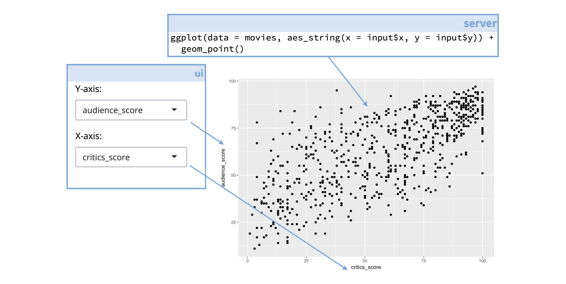
For example, if your app features a plot the code for building that plot lives in the server function. But the setup for the user defined inputs for the plot, as well as information on where physically on the app the plot should appear, are defined in the UI.
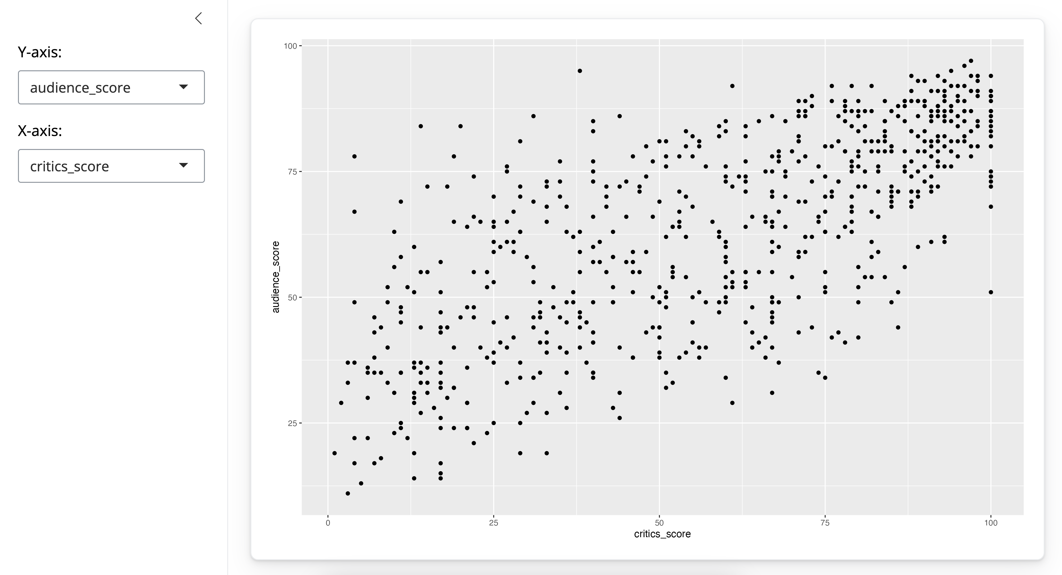
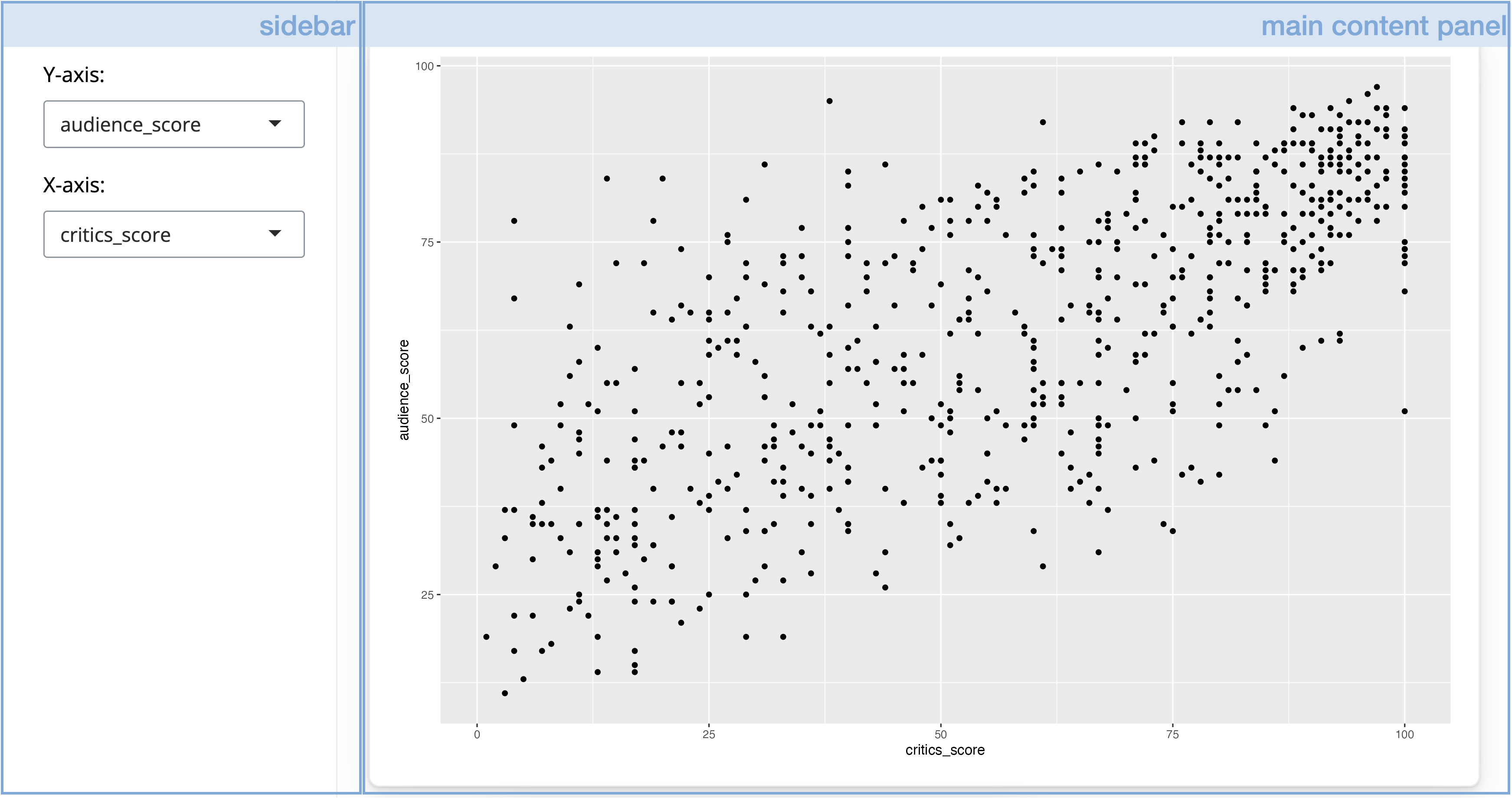
Here is the app we’ll work with in this section and the code that builds the UI of that app.
Since this is too much code to parse, we’ll explore individual components of the UI one by one.
Sidebar layout
At the outermost layer of our UI definition we begin with the page_sidebar() function.
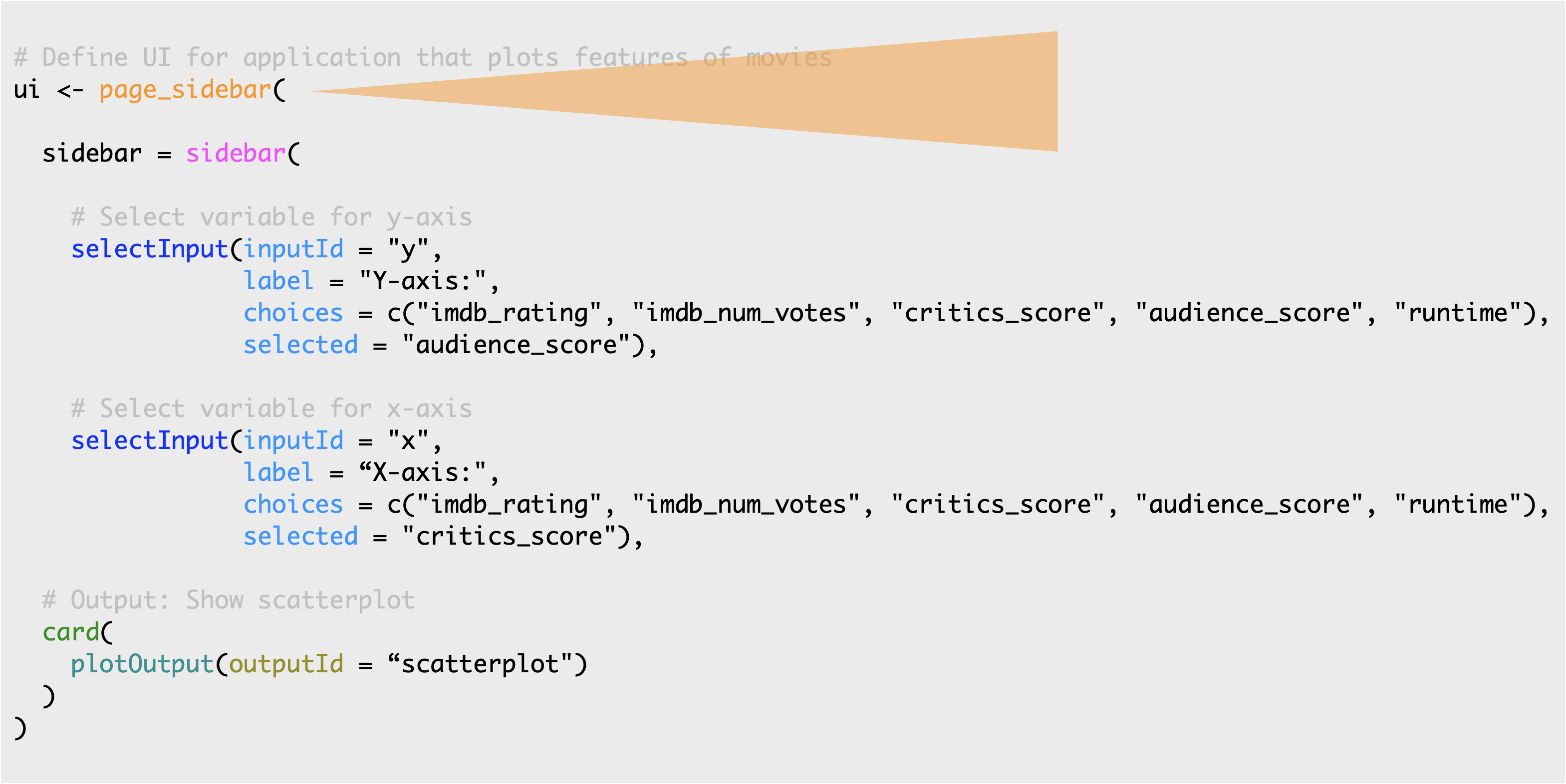
The page_sidebar() function creates a screen-filling page with a sidebar. Calling page_sidebar() is equivalent to calling layout_sidebar() inside page_fillable().
As always, for more information on arguments to any of these function, you can view the R function help by typing ?<function_name> (e.g., ?page_sidebar) in your R console or visiting the function reference page on the package website here.
To learn more about various layouts, I recommend reviewing the Application Layout Guide article at shiny.posit.co.
Input controls
Next we define our sidebar panel containing input controls. Define a sidebar with the sidebar() function.
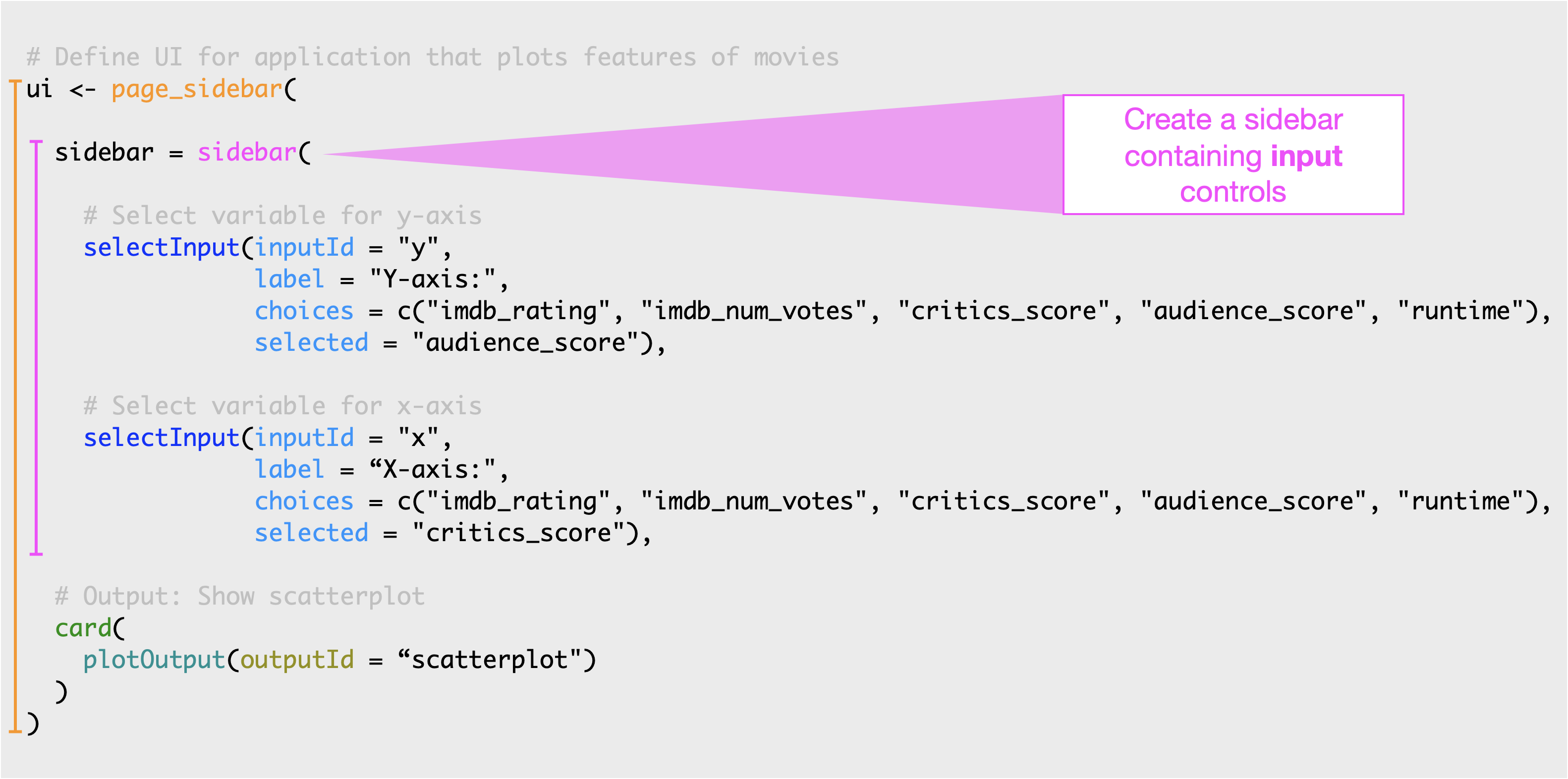
This panel contains two dropdown menus created with the selectInput() function.

Let’s take a look at one of the selectInput widgets a little more closely.
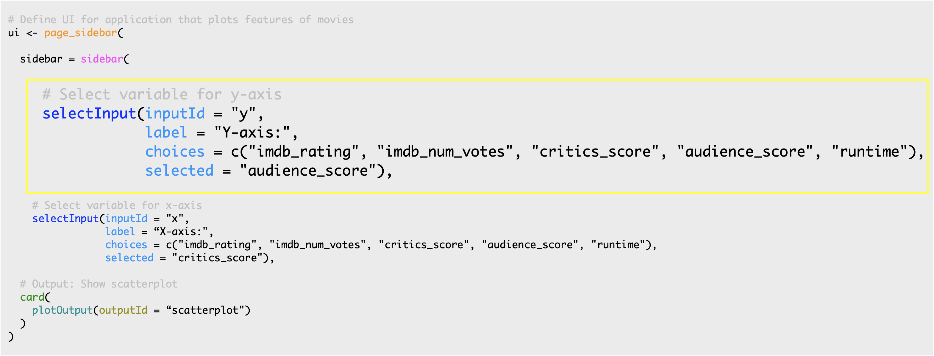
The first argument is the
inputId, which is the input value that the app will internally use to access the value selected by the user.The second argument is the
label, which is the display label that the user sees.The third argument is the list of
choicesthe user will choose from. In this app, these are variable names from the movies dataset.And lastly we specify a default selection from that list with
selected.
Main Panel
The final component of our UI is the main content area. Add elements to the main content area by passing additional UI elements to page_sidebar().
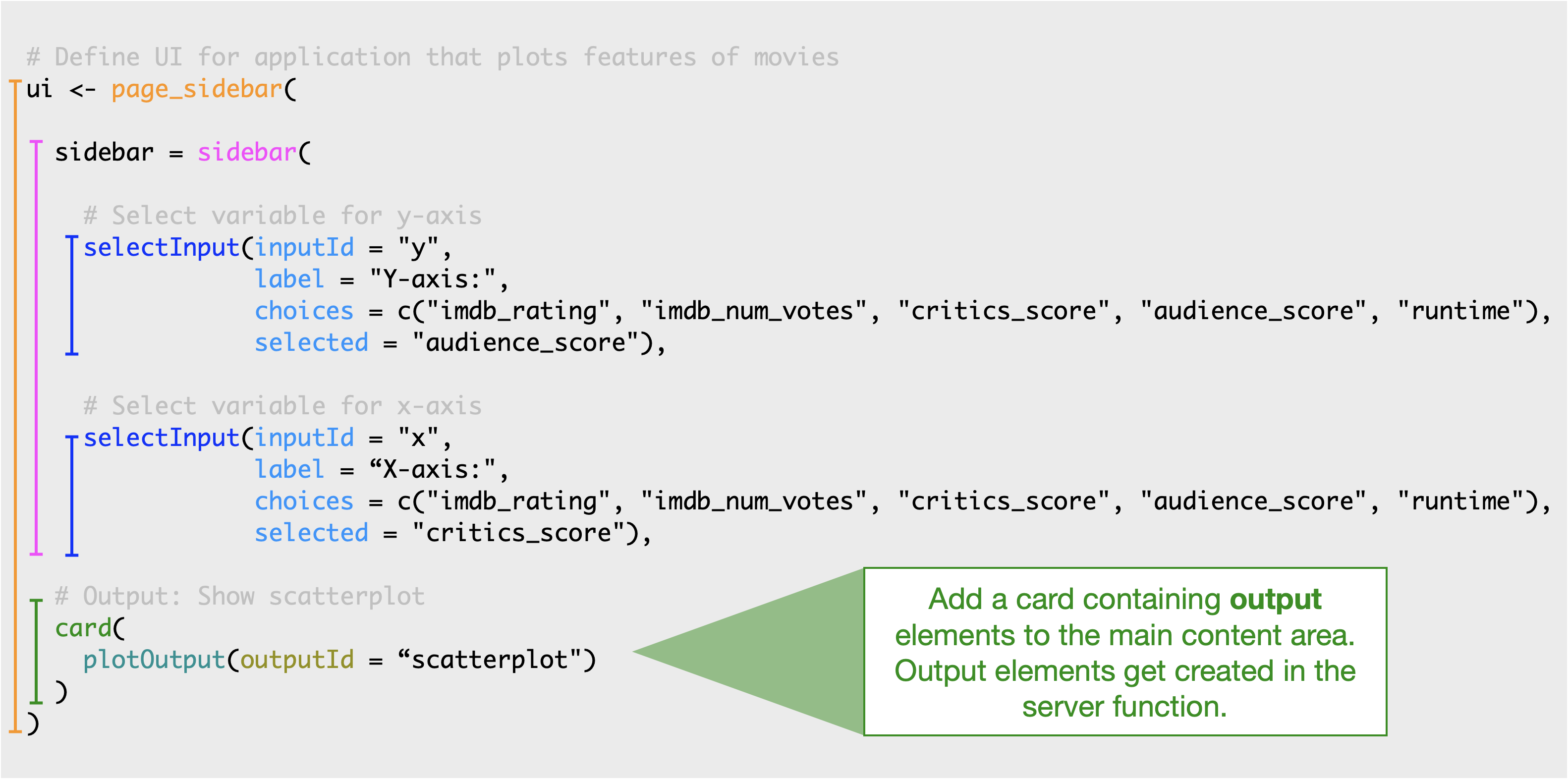
Currently the main content area contains only one component, a card containint a plot output. We’ll talk about how this plot is built later in the tutorial.
Next, let’s practice building an app UI!
Practice: Extend the UI
We’ll start with a simplified version of the app you saw in the previous exercise. In this app a selectInput() widget is used to allow the user to select which variables should be plotted on the x and y axes of the scatterplot.
The selectInput() function has the following arguments:
- an
inputIdthat is used to refer to the input parameter when building the scatterplot, - a list of
choicesto pick from (which must match variable names in the data frame), - and a
selectedchoice for when the app first launches.
Your turn
Modify the Shiny app code in app.R / shown below:
In the ui:
- Add a new
selectInputwidget to color the points by a choice of the following variables:"title_type","genre","mpaa_rating","critics_rating","audience_rating". - Make the default selection
"mpaa_rating". - Use
"z"as theinputId. labelcan be whatever you like.
In the server:
- Set the color argument in
ggplot()aesthetic mappings toinput$z.
Complete this exercise by opening up the RStudio Project titled 1-2a Extend the UI within your RStudio Cloud Workspace
Continue editing the file you started in the Getting Started section
OR
- Download the data if you haven’t already
```{r}
# Get the data

file <- "https://github.com/rstudio-education/shiny-course/raw/main/movies.RData"
destfile <- "movies.RData"

download.file(file, destfile)
```- Copy the code below into an R script
# Load packages ----------------------------------------------------------------
library(shiny)
library(bslib)
library(ggplot2)
# Load data --------------------------------------------------------------------
load("movies.RData")
# Define UI --------------------------------------------------------------------
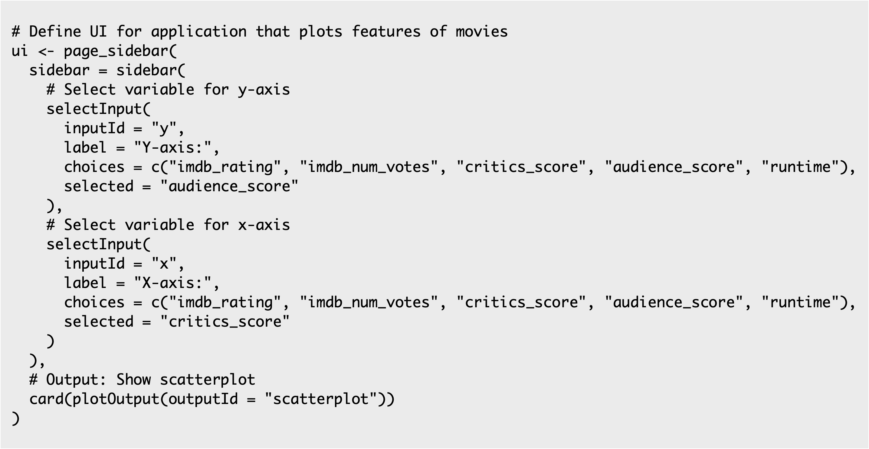
ui <- page_sidebar(
# Inputs: Select variables to plot
sidebar = sidebar(
# Select variable for y-axis
selectInput(inputId = "y",
label = "Y-axis:",
choices = c("imdb_rating", "imdb_num_votes", "critics_score", "audience_score", "runtime"),
selected = "audience_score"),
# Select variable for x-axis
selectInput(inputId = "x",
label = "X-axis:",
choices = c("imdb_rating", "imdb_num_votes", "critics_score", "audience_score", "runtime"),
selected = "critics_score"),
# Select variable for color
selectInput(inputId = "___",
label = "____",
choices = c(___),
selected = "___"),
),
# Output: Show scatterplot
card(
plotOutput(outputId = "scatterplot")
)
)
# Define server ----------------------------------------------------------------
server <- function(input, output, session) {
output$scatterplot <- renderPlot({
ggplot(data = movies, aes_string(x = input$x, y = input$y,
color = ___)) +
geom_point()
})
}
# Create a Shiny app object ----------------------------------------------------
shinyApp(ui = ui, server = server)# Load packages ----------------------------------------------------------------
library(shiny)
library(bslib)
library(ggplot2)
# Load data --------------------------------------------------------------------
load("movies.RData")
# Define UI --------------------------------------------------------------------
ui <- page_sidebar(
# Inputs: Select variables to plot
sidebar = sidebar(
# Select variable for y-axis
selectInput(inputId = "y",
label = "Y-axis:",
choices = c("imdb_rating", "imdb_num_votes", "critics_score", "audience_score", "runtime"),
selected = "audience_score"),
# Select variable for x-axis
selectInput(inputId = "x",
label = "X-axis:",
choices = c("imdb_rating", "imdb_num_votes", "critics_score", "audience_score", "runtime"),
selected = "critics_score"),
# Select variable for color
selectInput(inputId = "z",
label = "Color by:",
choices = c("title_type", "genre", "mpaa_rating", "critics_rating", "audience_rating"),
selected = "mpaa_rating")
),
# Output: Show scatterplot
card(
plotOutput(outputId = "scatterplot")
)
)
# Define server ----------------------------------------------------------------
server <- function(input, output, session) {
output$scatterplot <- renderPlot({
ggplot(data = movies, aes_string(x = input$x, y = input$y,
color = input$z)) +
geom_point()
})
}
# Create a Shiny app object ----------------------------------------------------
shinyApp(ui = ui, server = server)Practice: Extend the UI further
The potential variables the user can select for the x and y axes and color currently appear in the UI of the app the same way that they are spelled in the data frame header. However we might want to label them in a way that is more human readable. We can achieve this using named vectors for the choices argument, in the format of "Human readable label" = "variable_name".
Your turn
Fill in the blanks in the code below with human readable labels for
xandyinputs.Re-create the
selectInputwidget for color,z, with options"title_type","genre","mpaa_rating","critics_rating", and"audience_rating", default selection"mpaa_rating"just like in the previous exercise, but this time use human readable labels as well.
Complete this exercise by opening up the RStudio Project titled 1-2b Extend the UI further within your Posit Cloud Workspace
- Continue editing the code you’ve created with the code below
# Load packages ----------------------------------------------------------------

library(shiny)
library(bslib)
library(ggplot2)

# Load data --------------------------------------------------------------------

load("movies.RData")

# Define UI --------------------------------------------------------------------

ui <- page_sidebar(


    # Inputs: Select variables to plot
    sidebar = sidebar(

      # Select variable for y-axis
      selectInput(inputId = "y",
                  label = "Y-axis:",
                  choices = c(___ = "imdb_rating",
                              ___ = "imdb_num_votes",
                              ___ = "critics_score",
                              ___ = "audience_score",
                              ___ = "runtime"),
                  selected = "audience_score"),

      # Select variable for x-axis
      selectInput(inputId = "x",
                  label = "X-axis:",
                  choices = c(___ = "imdb_rating",
                              ___ = "imdb_num_votes",
                              ___ = "critics_score",
                              ___ = "audience_score",
                              ___ = "runtime"),
                  selected = "critics_score"),

      # Select variable for color
      selectInput(inputId = "z",
                  label = "Color:",
                  choices = ___,
                  selected = ___)
    ),

    # Output: Show scatterplot
    card(
      plotOutput(outputId = "scatterplot")
    )
)

# Define server ----------------------------------------------------------------

server <- function(input, output, session) {

  output$scatterplot <- renderPlot({
    ggplot(data = movies, aes_string(x = input$x, y = input$y,
                                     color = input$z)) +
      geom_point()
  })

  }

# Create a Shiny app object ----------------------------------------------------

shinyApp(ui = ui, server = server)# Load packages ----------------------------------------------------------------
library(shiny)
library(bslib)
library(ggplot2)
# Load data --------------------------------------------------------------------
load("movies.RData")
# Define UI --------------------------------------------------------------------
ui <- page_sidebar(
# Inputs: Select variables to plot
sidebar = sidebar(
# Select variable for y-axis
selectInput(inputId = "y",
label = "Y-axis:",
choices = c("IMDB rating" = "imdb_rating",
"IMDB number of votes" = "imdb_num_votes",
"Critics score" = "critics_score",
"Audience score" = "audience_score",
"Runtime" = "runtime"),
selected = "audience_score"),
# Select variable for x-axis
selectInput(inputId = "x",
label = "X-axis:",
choices = c(
"IMDB rating" = "imdb_rating",
"IMDB number of votes" = "imdb_num_votes",
"Critics score" = "critics_score",
"Audience score" = "audience_score",
"Runtime" = "runtime"),
selected = "critics_score"),
# Select variable for color
# Select variable for color
selectInput(inputId = "z",
label = "Color by:",
choices = c(
"Title type" = "title_type",
"Genre" = "genre",
"MPAA rating" = "mpaa_rating",
"Critics rating" = "critics_rating",
"Audience rating" = "audience_rating"),
selected = "mpaa_rating")
),
# Output: Show scatterplot
card(
plotOutput(outputId = "scatterplot")
)
)
# Define server ----------------------------------------------------------------
server <- function(input, output, session) {
output$scatterplot <- renderPlot({
ggplot(data = movies, aes_string(x = input$x, y = input$y,
color = input$z)) +
geom_point()
})
}
# Create a Shiny app object ----------------------------------------------------
shinyApp(ui = ui, server = server)