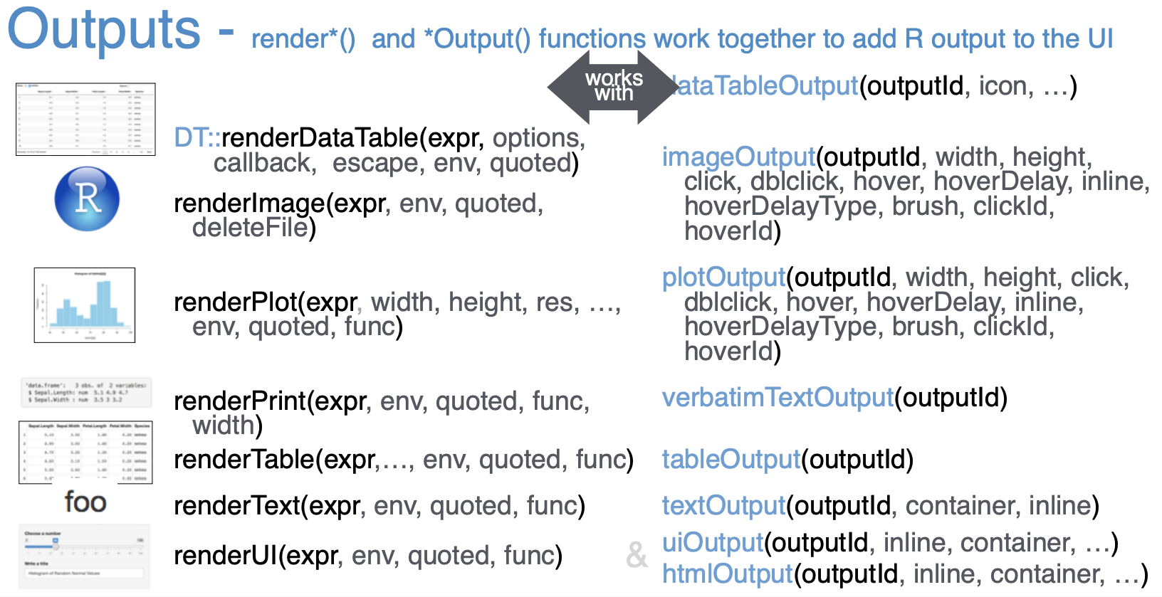
Rendering functions
render*() functions
The goal of this section is to build familiarity with a few rendering functions.
As we mentioned earlier in the course, Shiny provides a wide selection of output types, each of which works with a render function. We looked at the renderPlot() function before.
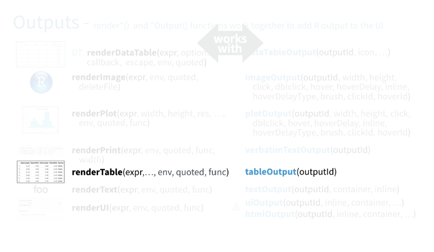
Now let’s take a look at the renderTable() function.
This is the app you’ve seen numerous times so far that we will use as our starting point.
And this is the final app that we want to achieve, with a summary table beneath the plot.
renderTable
So we want to add a summary table beneath the plot displaying summary statistics for a new variable we’ll create: score_ratio, the ratio of audience scores to critics scores.
We need to make four modifications to our app to accomplish this.
- Calculate the new variable
- In the ui: Add an input widget that the user can interact with to check boxes for selected title types.
- In the ui: Add an output defining where the summary tables should appear.
- In the server function: Add a reactive expression that creates the summary table.
We’ll go through these steps one by one.
1. Calculate the new variable.
# Create new variable:
# ratio of critics and audience scores
movies <- movies %>%
  mutate(score_ratio = audience_score / critics_score)
First is creating the new variable, which we can do outside of the ui and the server so it’s calculated once when our app launches.
There are many ways one can create the new variable in R. We do so here using the mutate() function from the dplyr package.
2. ui: Add an input widget that the user can interact with to check boxes for selected title types.
# Subset for title types
checkboxGroupInput(inputId = "selected_title_type",
                   label = "Select title type:",
                   choices = levels(movies$title_type),
selected = levels(movies$title_type))- The first argument is the
inputId. - Next is the user facing
label. - Third, we define the
choices. Previously we manually entered the choices. We present an alternative approach here, directly using information from the dataset. Specifically, the choices we want are the levels of thetitle_typevariable. And by default we select all of them.
3. ui: Add an output defining where the summary tables should appear.
card(
  # Show scatterplot
  plotOutput(outputId = "scatterplot"),
  # Show data table
  tableOutput(outputId = "summarytable")
)
We use the tableOutput() function for this. This function takes one argument, the outputId.
4. server: Add a reactive expression that creates the summary table.
Lastly, in the server, we describe how this table should be calculated with the renderTable() function.
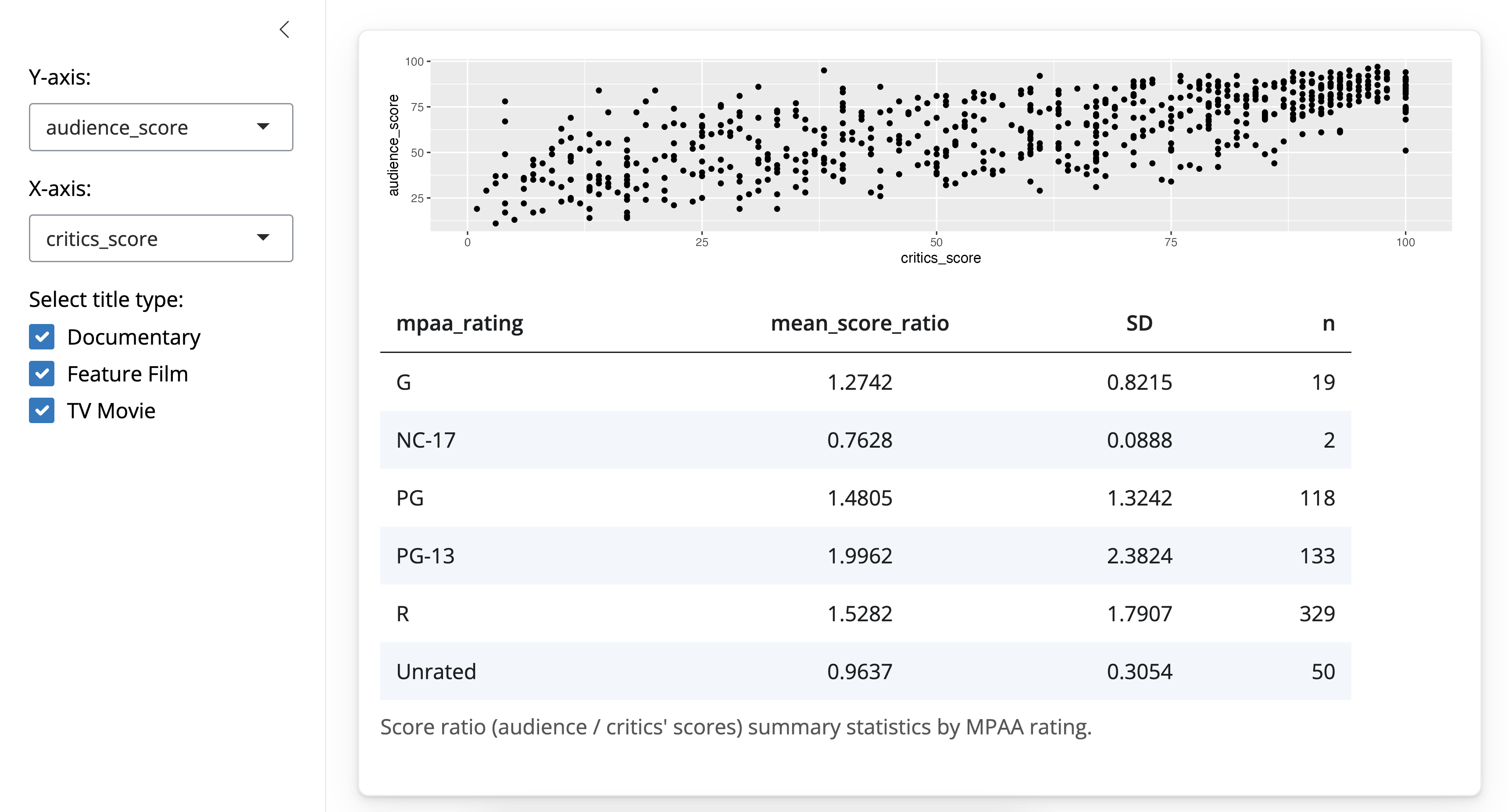
output$summarytable <- renderTable(
  {
    movies %>%
      filter(title_type %in% input$selected_title_type) %>%
      group_by(mpaa_rating) %>%
      summarise(mean_score_ratio = mean(score_ratio), SD = sd(score_ratio), n = n())
  },
  striped = TRUE,
  spacing = "l",
  align = "lccr",
  digits = 4,
  width = "90%",
  caption = "Score ratio (audience / critics' scores) summary statistics by MPAA rating."
)
Note that the name of the output created by the render function should match the name we used for the output in the ui (summarytable).
The first argument is the expression that returns an R object in tabular form.
  {
    movies %>%
      filter(title_type %in% input$selected_title_type) %>%
      group_by(mpaa_rating) %>%
      summarise(mean_score_ratio = mean(score_ratio), SD = sd(score_ratio), n = n())
  }
Note that we wrap the expression with curly braces. The expression first filters for the selected title types. Since this is a user selection, the information is in the input list generated in the ui.
Then, the expression groups the data by MPAA rating, and then calculates summary statistics like means, standard deviations, and sample sizes for each level of MPAA ratings.
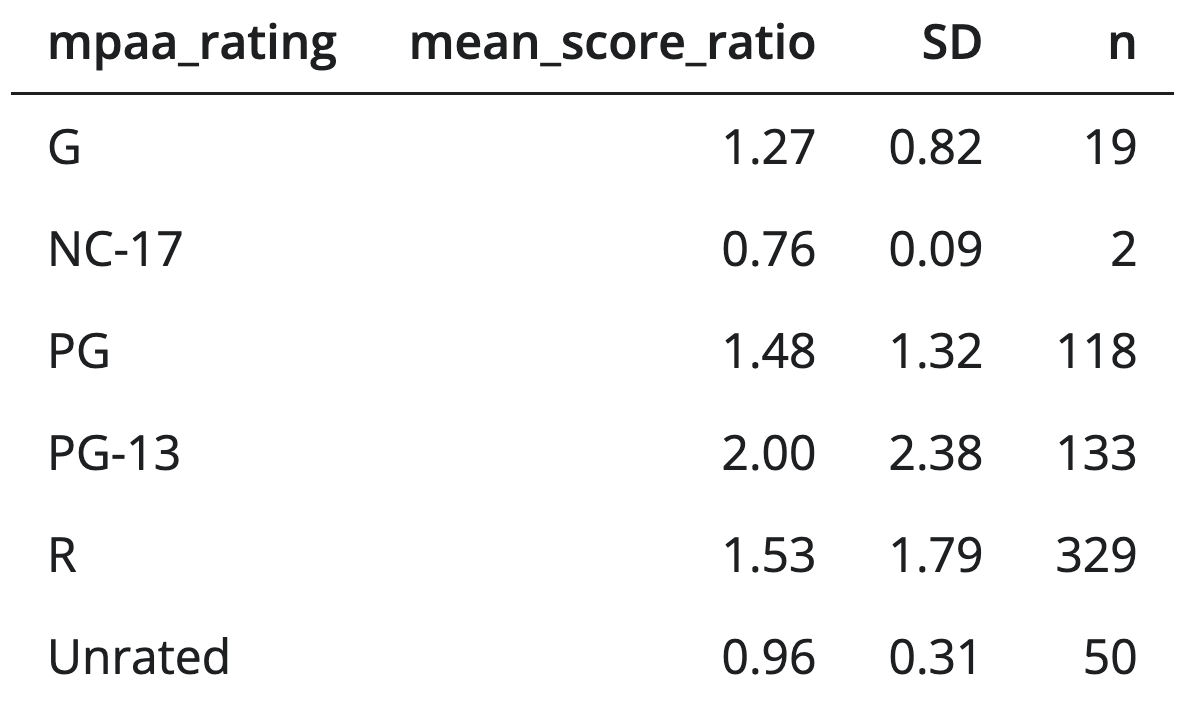
If we stopped here and didn’t include any of the following arguments, the app would look something like this:
But we want our table to look like this:
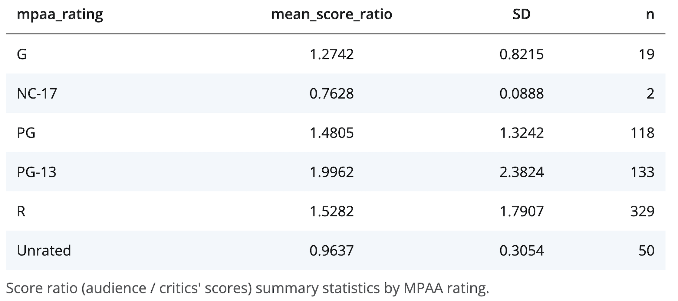
In order to achieve this look, we add additional arguments to our render* function.
striped = TRUE, spacing = "l", align = "lccr", digits = 4, width = "90%",
caption = "Score ratio (audience / critics' scores) summary statistics by MPAA rating."
striped = TRUEfor alternating color rowsspacing = "l"for larger row heights- the
alignargument for left, right, or center alignment of columns digitsfor number of decimal places to displaywidthfor, well, width of the table output- and lastly a caption.
Recap
Shiny has a variety of
render*()functions with corresponding*Output()functions to create and display outputs.render*()functions can take on multiple arguments, the first being the expression for the desired output.The expression in the
render*()function should be wrapped in curly braces.
Alright, it’s time for you to practice render*() functions!
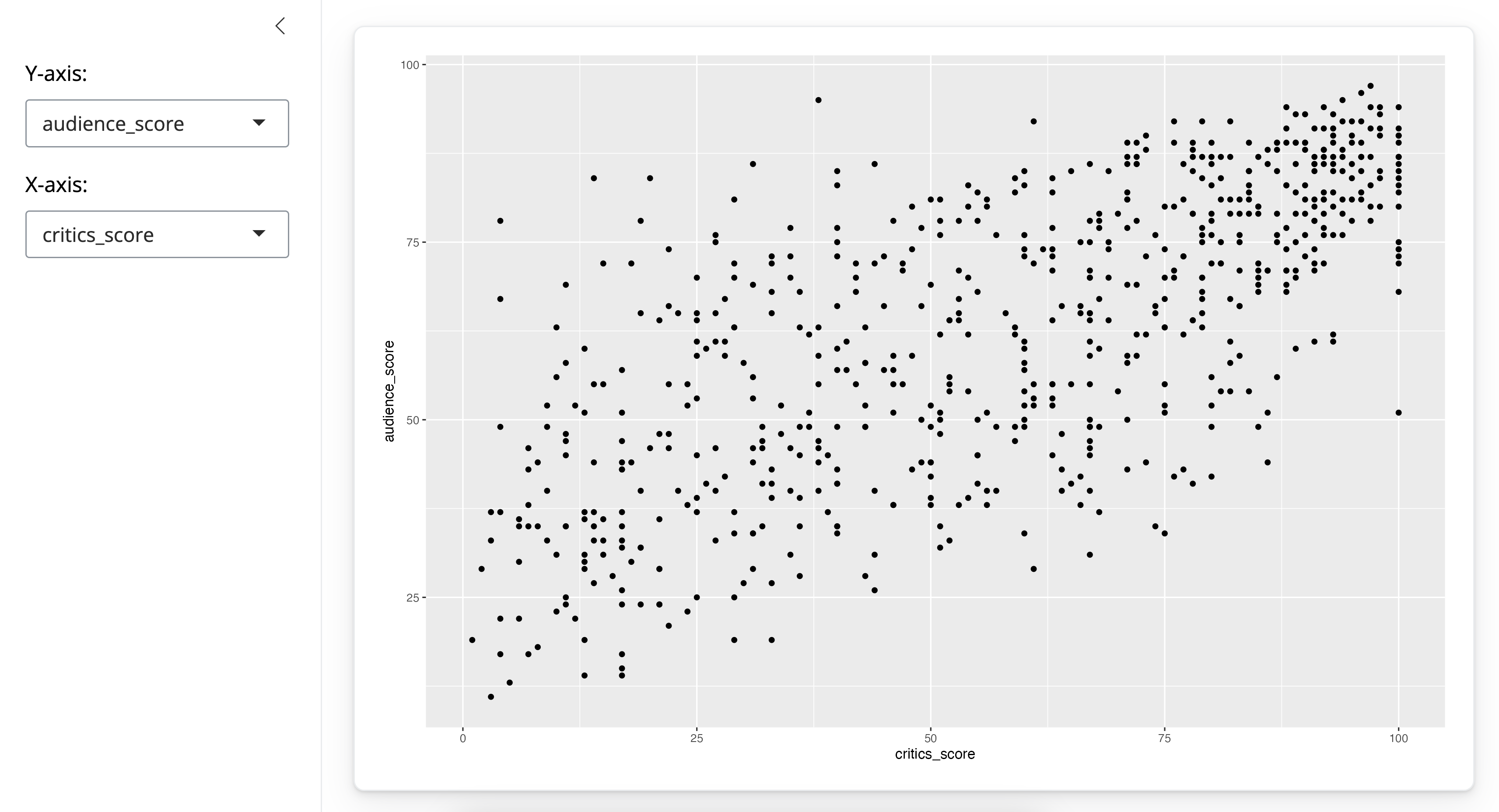
Practice: Missing renderPlot()
The following app is one you’ve seen before – it creates a scatterplot of two variables selected by the user. However it’s missing a crucial component, and hence the plot is not rendered.
Your turn
- Fix the app code by adding the missing component, and run to confirm that it works.
Complete the exercise by navigating to the RStudio Cloud Project titled 2-3a Missing renderPlot in your Posit Cloud Workspace
- Copy the code below into an R script
# Load packages ----------------------------------------------------------------

library(shiny)
library(bslib)
library(ggplot2)
library(dplyr)

# Load data --------------------------------------------------------------------

load("movies.RData")

# Define UI --------------------------------------------------------------------

ui <- page_sidebar(

    sidebar = sidebar(

      selectInput(inputId = "y",
                  label = "Y-axis:",
                  choices = c("imdb_rating", "imdb_num_votes", "critics_score", "audience_score", "runtime"),
                  selected = "audience_score"),

      selectInput(inputId = "x",
                  label = "X-axis:",
                  choices = c("imdb_rating", "imdb_num_votes", "critics_score", "audience_score", "runtime"),
                  selected = "critics_score")
    ),

    card(
      plotOutput(outputId = "scatterplot")
    )
)

# Define server ----------------------------------------------------------------

server <- function(input, output, session) {

  output$scatterplot <- ggplot(data = movies, aes_string(x = input$x, y = input$y)) +
    geom_point()

  }

# Create a Shiny app object ----------------------------------------------------

shinyApp(ui = ui, server = server)# Load packages ----------------------------------------------------------------
library(shiny)
library(bslib)
library(ggplot2)
library(dplyr)
# Load data --------------------------------------------------------------------
load("movies.RData")
# Define UI --------------------------------------------------------------------
ui <- page_sidebar(
sidebar = sidebar(
selectInput(
inputId = "y",
label = "Y-axis:",
choices = c("imdb_rating", "imdb_num_votes", "critics_score", "audience_score", "runtime"),
selected = "audience_score"
),
selectInput(
inputId = "x",
label = "X-axis:",
choices = c("imdb_rating", "imdb_num_votes", "critics_score", "audience_score", "runtime"),
selected = "critics_score"
)
),
card(
plotOutput(outputId = "scatterplot")
)
)
# Define server ----------------------------------------------------------------
server <- function(input, output, session) {
output$scatterplot <- renderPlot({
ggplot(data = movies, aes_string(x = input$x, y = input$y)) +
geom_point()
})
}
# Create a Shiny app object ----------------------------------------------------
shinyApp(ui = ui, server = server)Practice: Add renderText()
In this app, the user selects x and y variables for the scatterplot. We will extend the app to also include a textOutput which prints the correlation between the two selected variables as well some informational text.
Your turn
Create the text to be printed using the
paste()function: “Correlation = ____. Note: If the relationship between the two variables is not linear, the correlation coefficient will not be meaningful.”Place the text within the
renderText()function, and assign tooutput$text$.
Complete the exercise by navigating to the RStudio Cloud Project titled 2-3b Add renderText in your Posit Cloud Workspace.
- Copy the code below into an R script
# Load packages ----------------------------------------------------------------

library(shiny)
library(bslib)
library(ggplot2)
library(dplyr)

# Load data --------------------------------------------------------------------

load("movies.RData")

# Define UI --------------------------------------------------------------------

ui <- page_sidebar(

    sidebar = sidebar(

      selectInput(inputId = "y",
                  label = "Y-axis:",
                  choices = c("imdb_rating", "imdb_num_votes", "critics_score", "audience_score", "runtime"),
                  selected = "audience_score"),

      selectInput(inputId = "x",
                  label = "X-axis:",
                  choices = c("imdb_rating", "imdb_num_votes", "critics_score", "audience_score", "runtime"),
                  selected = "critics_score")
    ),

    card(
      plotOutput(outputId = "scatterplot"),
      textOutput(outputId = "correlation")
    )
)

# Define server ----------------------------------------------------------------

server <- function(input, output, session) {

  output$scatterplot <- renderPlot({
    ggplot(data = movies, aes_string(x = input$x, y = input$y)) +
      geom_point()
  })

  # Create text output stating the correlation between the two ploted
  output$correlation <- ___

  s}

# Create the Shiny app object --------------------------------------------------

shinyApp(ui = ui, server = server)# Load packages ----------------------------------------------------------------
library(shiny)
library(bslib)
library(ggplot2)
library(dplyr)
# Load data --------------------------------------------------------------------
load("movies.RData")
# Define UI --------------------------------------------------------------------
ui <- page_sidebar(
sidebar = sidebar(
selectInput(
inputId = "y",
label = "Y-axis:",
choices = c("imdb_rating", "imdb_num_votes", "critics_score", "audience_score", "runtime"),
selected = "audience_score"
),
selectInput(
inputId = "x",
label = "X-axis:",
choices = c("imdb_rating", "imdb_num_votes", "critics_score", "audience_score", "runtime"),
selected = "critics_score"
)
),
card(
plotOutput(outputId = "scatterplot"),
textOutput(outputId = "correlation")
)
)
# Define server ----------------------------------------------------------------
server <- function(input, output, session) {
output$scatterplot <- renderPlot({
ggplot(data = movies, aes_string(x = input$x, y = input$y)) +
geom_point()
})
# Create text output stating the correlation between the two ploted
output$correlation <- renderText({
r <- round(cor(movies[, input$x], movies[, input$y], use = "pairwise"), 3)
paste0(
"Correlation = ", r,
". Note: If the relationship between the two variables is not linear, the correlation coefficient will not be meaningful."
)
})
}
# Create the Shiny app object --------------------------------------------------
shinyApp(ui = ui, server = server)