Notifications
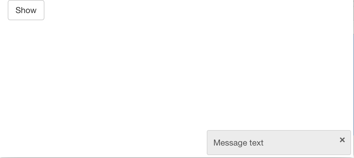
As of version 0.14, Shiny can display notifications on the client browser by using the showNotification() function. You can see an example of them here.
In this example, we’ll use an observeEvent() to display the notification when the Show button is pressed:
shinyApp(
  ui = fluidPage(
    actionButton("show", "Show")
  ),
  server = function(input, output) {
    observeEvent(input$show, {
      showNotification("This is a notification.")
    })
  }
)
The notification will appear in the bottom right corner of the browser, remain for 5 seconds, and then fade away.

The are a number options that control the behavior and appearance of notifications
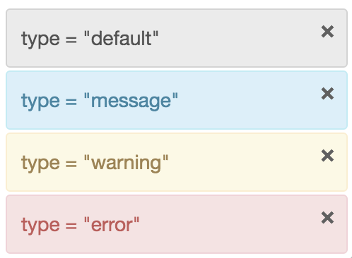
The default color of the notification is gray, but you can use other colors with the type argument. It can be "default", "message", "warning", or "error", which will display as shown below:

By default, a close button will be displayed on the right side of each notification, but it can be removed with closeButton=FALSE.
The action argument is an additional way of providing content in the notification. The action UI components will appear underneath the main text. The reason that it is separate is so that it can be custom-styled with CSS.
The showNotification() function returns an ID value which can be passed to removeNotification()to remove the notification from the server side. For example, this application has one button that will present a notification, and another that will remove it:
shinyApp(
  ui = fluidPage(
    actionButton("show", "Show"),
    actionButton("remove", "Remove")
  ),
  server = function(input, output) {
    # A notification ID
    id <- NULL

    observeEvent(input$show, {
      # If there's currently a notification, don't add another
      if (!is.null(id))
        return()
      # Save the ID for removal later
      id <<- showNotification(paste("Notification message"), duration = 0)
    })

    observeEvent(input$remove, {
      if (!is.null(id))
        removeNotification(id)
      id <<- NULL
    })
  }
)